Asking users to manually highlight and copy text like a coupon code, referral link, or email address adds friction. If they struggle to copy it on a mobile device, they might give up entirely.
The Clipboard element solves this by letting users copy any text with a single tap.
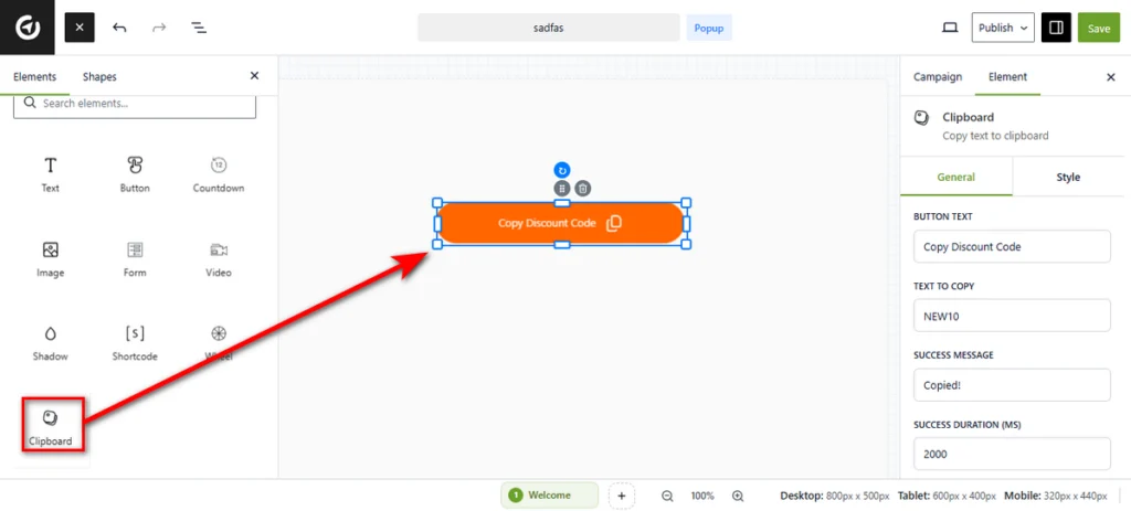
1. Add the Element
Open your campaign in the Canvas Builder. Locate the Clipboard element in the left panel and drag it onto your canvas.
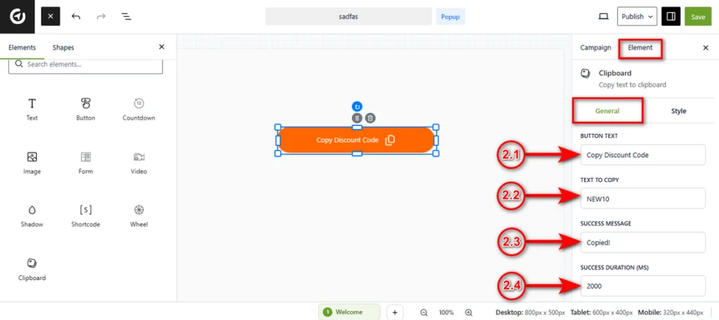
2. Configure Content Settings
Once added, the General tab will be active by default. Here is how to configure the button’s functionality.
2.1 Button Text: Enter the label you want users to see on the button itself, such as “Copy Our Email” or “Grab Discount Code”.
2.2 Text to Copy: This is the actual content that will be saved to the user’s clipboard when they click.
You can type any static text here (e.g., [email protected] or SUMMER50).
2.3 Success Message: Enter the confirmation text that appears temporarily after clicking, such as “Copied!”.
2.4 Success Duration (ms): Define how long (in milliseconds) the success message stays visible before reverting to the original button text.
The default is 2000 (2 seconds).
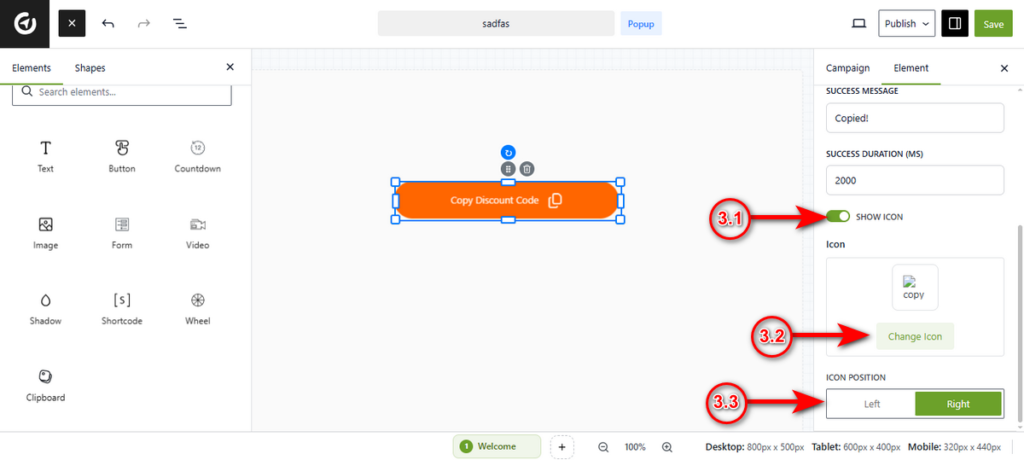
3. Icon Settings
Scroll down within the General tab to add visual cues.
3.1 Show Icon: Toggle this switch to On to display a graphic alongside your text.
3.2 Icon: Click the Change Icon button to select a symbol from the library (e.g., a copy symbol or clipboard icon).
3.3 Icon Position: Use the toggle to place the icon to the Left or Right of the button text.
4. Style the Button
Click on the Style tab at the top of the sidebar to access design options. Once you tap into the Style tab, you’ll notice two style options: General andIcon styles.
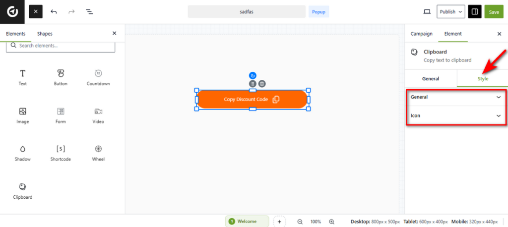
General Styles
Expand the General accordion to tweak the button’s appearance.
- Colors: Set the Color (text) and Background Color to match your brand.
- Typography: Adjust the Font Family, Weight, Size, and Line Height.
- Formatting: Use the sliders and toggles to adjust Letter Spacing, Text Alignment, Letter Case (e.g., uppercase), and Decoration (e.g., underline).
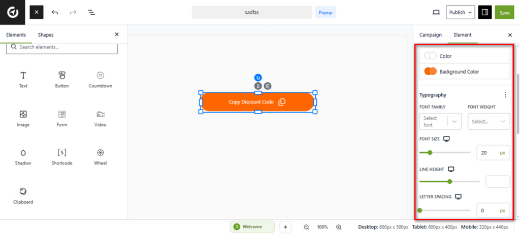
- Padding: Use the sliders to control the spacing inside the button (Top, Right, Bottom, Left).
- Border & Shadow: Click the + icon next to Border to add an outline, or the edit icon next to Box Shadow to add depth.
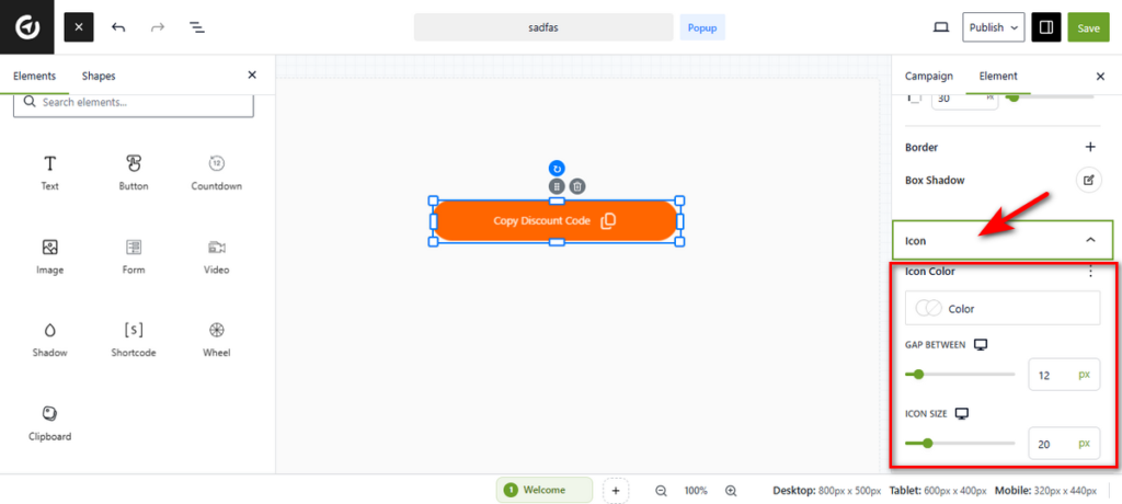
Icon Styles
Expand the Icon accordion to style the graphic specifically.
- Icon Color: Select a specific color for the icon to make it stand out.
- Gap Between: Use the slider to increase or decrease the space between the button text and the icon.
- Icon Size: Adjust the slider to make the icon larger or smaller.
That’s it. You can now let users copy any important information instantly.


