In OptinCraft’s drag-and-drop popup builder, the Button Element lets you insert customizable buttons directly into your popup layouts. These buttons can perform actions like redirecting visitors to another page, launching a campaign, or even closing the popup after the user interacts with it. The editor is visual and intuitive so you can place, label, and style your button without any coding.
How to Use Button Element in OptinCraft #
The Button Element in OptinCraft allows you to create clickable call-to-action buttons inside your popups. You can use it to redirect visitors, close popups, or guide users to the next step in your campaign.
Follow the steps below to add and configure a button in OptinCraft.
Step 1: Open the OptinCraft Popup Builder #
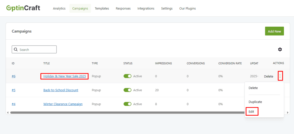
- Log in to your WordPress dashboard
- Go to OptinCraft → Campaign
- Create a new campaign or edit an existing one
- Launch the drag-and-drop popup editor
Step 2: Add the Button Element #
- In the editor sidebar, locate the Button Element
- Drag and drop the Button Element onto your popup canvas
- Place it where you want the call-to-action to appear
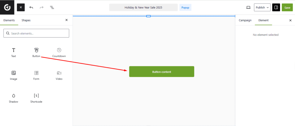
Once added, the button will appear with default text and styling.
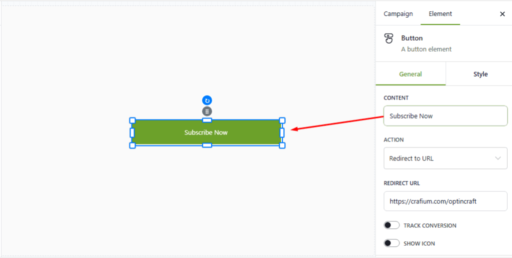
Step 3: Customize Button Text #
- Click on the button inside the editor
- In the settings panel, Edit the Button Label
- Examples:
- “Subscribe Now”
- “Get the Free Guide”
- “Claim Your Discount”
- Examples:
👉 Tip: Use action-oriented text to improve clicks.
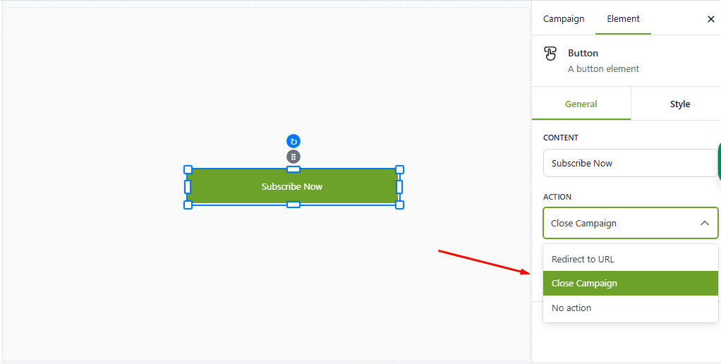
Step 4: Set Button Action (What Happens on Click) #
OptinCraft allows you to define what the button does when clicked.
Common options include:
- Redirect to URL—Send users to another page (landing page, checkout, blog post)
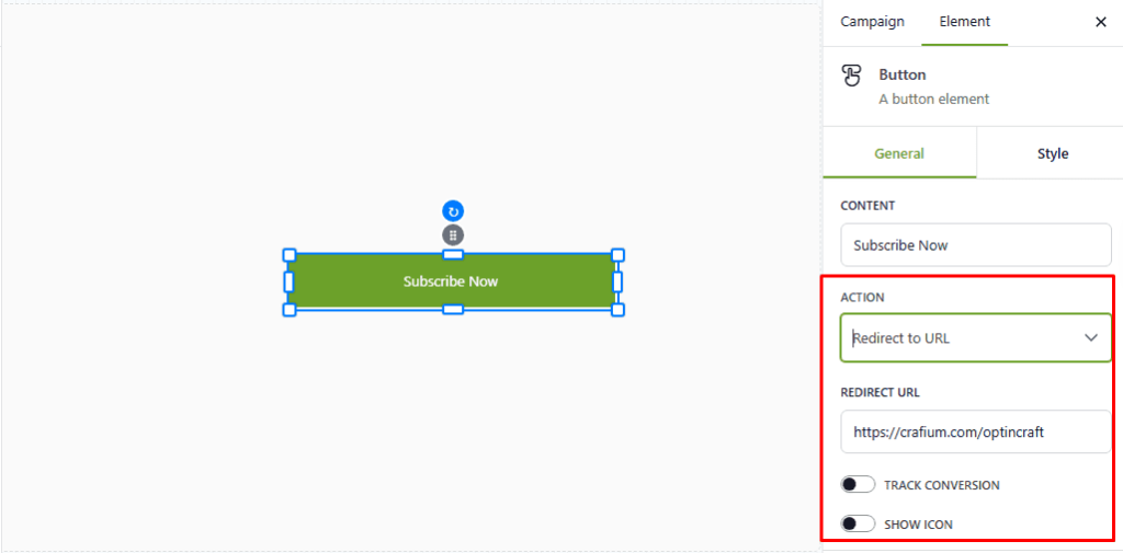
- Close Popup/Campaign – Close the popup after interaction
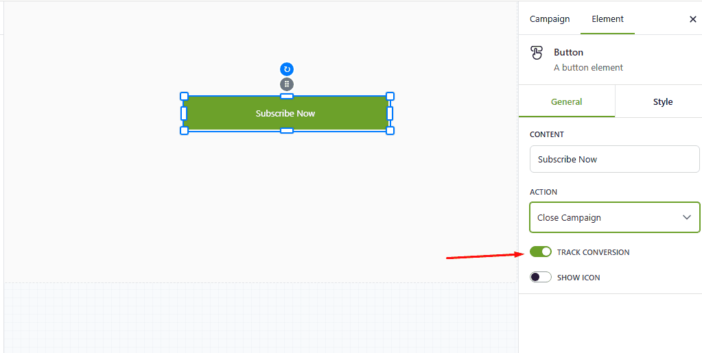
Track Conversion—Track the conversion just by toggling the TRACK CONVERSION button ON.
Choose the action that matches your campaign goal.
Step 5: Style the Button #
You can fully customize the button’s appearance to match your brand.
Available styling options typically include:
- Button background color
- Text color
- Font size
- Border radius
- Padding and alignment
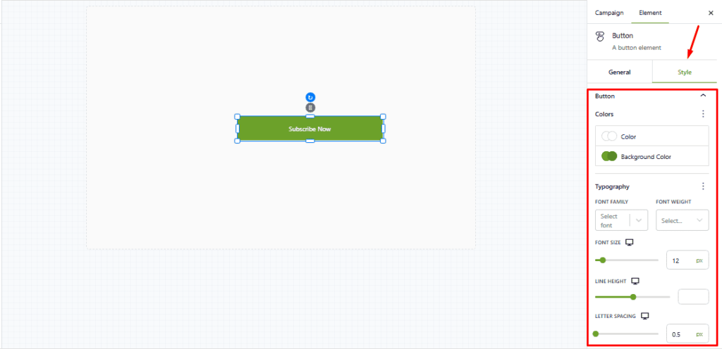
Make sure your button stands out visually from the rest of the popup.
Step 7: Preview & Test #
Before publishing:
- Preview the popup on desktop and mobile
- Click the button to confirm:
- The action works correctly
- The link opens properly
- The popup closes or transitions as expected
Best Practices for Button Usage #
- Use one main button per popup to avoid confusion
- Keep button text short and benefit-focused
- Use contrast colors for better visibility
- Pair the button with a clear headline and message
Example Use Cases #
- Lead Generation: “Subscribe Now” → redirects to a thank-you page
- Promotions: “Get 20% Off” → links to a product page
- Navigation: “Learn More” → opens a detailed guide


