A Complete Guide to Popup Triggers & A/B Testing Them
William Tan
William Tan is a Digital Marketer at Crafium,…
In this article
Popups can skyrocket conversions or quietly drive visitors away.
Most websites use popup triggers the wrong way. They show forms too early, interrupt readers mid-sentence, or bombard visitors with the same generic message every time.
The result? Annoyed users, higher bounce rates, and missed opportunities that cost you leads and sales every single day. You might have great offers, valuable content, or irresistible discounts… but if your timing is off by just a few seconds, people close the tab before they ever see them.
And it gets more frustrating: even when a popup “works,” how do you know it’s actually the best it could be? Maybe a different trigger, delay, or behavior could double your results but without testing, you’re just guessing.
That’s where strategy replaces luck.
In this complete guide, you’ll learn exactly how popup triggers work, when to use each type, and how to systematically A/B test them to find what truly converts.
So, without further ado, let’s dig deeper.
Why Popup Timing Matters More Than You Think
Popup timing seems like a small UX detail, but it can make or break how people feel about your site or app. It directly affects attention, trust, and whether someone converts or leaves.
Here’s why timing matters more than most people expect:
If it appears too early → people bounce
When a popup shows the second a page loads, users haven’t had time to understand what you offer. It feels interruptive and pushy. Instead of signing up, many just close the tab.
If it appears too late → you miss the chance
If you wait until someone is already about to leave (or never show it at all), you lose potential subscribers or customers who might have converted with a small nudge.
Good timing feels helpful, not annoying
The best popups feel like they show up because of what the user is doing:
- After scrolling 50–70% → they’re engaged
- After 20–40 seconds → they’ve read enough to care
- On exit intent → last-chance offer
- After an action → “Want 10% off your first order?”
This makes the popup feel relevant rather than random.
It affects trust and brand perception
Bad timing = “spammy”
Good timing = “useful”
Even the same offer can feel completely different depending on when it appears.
It directly impacts conversions
Small timing tweaks often change results a lot. For example:
- Immediate popup: low signups + high bounce
- Delayed/behavior-based popup: fewer interruptions + higher signup rate
Many teams see 2–3× better performance just by adjusting timing.
What Are Popup Triggers? (And Why They Work)
Popup triggers are the rules that decide when a popup appears.
Instead of showing a popup randomly or immediately, triggers use user behavior or timing signals to show the message at the moment someone is most likely to care.
Think of triggers like this:
👉 “Show this popup only when the visitor seems ready.”
That’s why they work so well.
What exactly is a popup trigger?
A popup trigger is an event or condition that activates a popup.
For example:
- “After 30 seconds”
- “After scrolling halfway”
- “When the mouse moves toward the exit button”
Each of these tells the system when to show the message.
Common types of popup triggers
⏱ Time-based triggers
Show after a set amount of time (e.g., 20–40 seconds).
Why it works:
Gives visitors time to understand your page first. They’re warmer and more likely to say yes.
Best for:
- Blog subscriptions
- Newsletters
- Lead magnets
📜 Scroll-based triggers
Show after someone scrolls 50–70% down the page.
Why it works:
Scrolling shows engagement. If they’re reading that far, they’re interested.
Best for:
- Content upgrades
- Email capture
- Related offers
🚪 Exit-intent triggers
Show when the user moves their cursor toward closing the tab or leaving.
Why it works:
It’s a “last chance” moment. You’re not interrupting — you’re catching them before they go.
Best for:
- Discounts
- Cart recovery
- Special offers
🖱 Click-based triggers (2-step popups)
Popup appears only after clicking a button or link.
Why it works:
They choose to open it. No interruption at all. This often converts the best.
Best for:
- “Get the guide”
- “Sign up”
- “Book a demo”
🧠 Behavior-based triggers
Triggered by actions like:
- Visiting multiple pages
- Returning visitors
- Time on site
- Adding to cart
Why it works:
Feels personalized and relevant, not generic.
Best for:
- E-commerce offers
- Targeted promotions
- Advanced marketing
Why triggers work (psychology)
Triggers succeed because they:
- Respect attention (don’t interrupt immediately)
- Match intent (show relevant offers)
- Reduce annoyance
- Feel timely instead of pushy
Bad popup:
“Hey! Sign up!” (instantly)
Good popup:
“You’ve read most of this guide — want the free checklist?”
Same offer. Very different reaction.
Types of Popup Triggers Explained (With Use Cases)
Popup triggers are the logic behind when a popup appears. Instead of interrupting visitors at random, triggers use behavior and context to show a message at the moment someone is most likely to respond.
When done right, popups feel helpful and timely. When done wrong, they feel annoying and pushy. The trigger is usually the difference.
Here’s a clear breakdown of the main types of popup triggers and when to use each one.
1. Time-Based Triggers
What they are:
Show a popup after a set amount of time (for example, 20–40 seconds).
Why they work:
Visitors get a chance to understand your page first. By the time the popup appears, they’re more interested and less likely to feel interrupted.
Best use cases:
- Newsletter signups
- Free downloads or lead magnets
- First-time visitor offers
- Blog or content sites
Tip:
Avoid very short delays (like 3–5 seconds). It still feels instant and annoying.
2. Scroll-Based Triggers
What they are:
Popup appears after a visitor scrolls a certain percentage down the page (commonly 50–70%).
Why they work:
Scrolling signals engagement. If someone has read halfway or more, they clearly care about the content.
Best use cases:
- Content upgrades
- “Related resources”
- Email capture on articles
- Webinar or course promotions
Tip:
Match the offer to the content they just read for better results.
3. Exit-Intent Triggers
What they are:
Popup shows when the user moves their cursor toward closing the tab or leaving the page (mostly desktop).
Why they work:
You’re not interrupting their experience rather you’re catching them at the last second. It feels less intrusive and can recover lost conversions.
Best use cases:
- Discount codes
- Cart abandonment offers
- “Wait! Before you go…” deals
- Feedback surveys
Tip:
Keep the message short and compelling. This is your last chance.
4. Click-Based Triggers (Two-Step Popups)
What they are:
Popup opens only after the user clicks a button or link.
Why they work:
There’s no interruption. The visitor chooses to engage, which creates higher intent and often better conversions.
Best use cases:
- “Get the guide”
- “Start free trial”
- “Book a demo”
- Gated content
Tip:
These often outperform automatic popups because they feel voluntary.
5. Behavior-Based Triggers
What they are:
Popups triggered by specific actions or patterns, such as:
- Visiting multiple pages
- Spending several minutes on site
- Returning visitors
- Adding items to cart
Why they work:
They feel personalized and relevant. Instead of showing the same popup to everyone, you respond to what the visitor is actually doing.
Best use cases:
- E-commerce upsells
- Loyalty rewards
- Personalized recommendations
- Targeted promotions
Tip:
Use sparingly and keep it relevant because over-targeting can feel creepy.
6. Page- or Context-Based Triggers
What they are:
Popups that appear only on certain pages or categories.
Why they work:
They match user intent. Someone reading pricing likely wants something different than someone reading a blog post.
Best use cases:
- Pricing page → demo or sales call
- Product page → discount or bundle
- Blog → newsletter signup
Tip:
Align the message with the page’s goal.
Which triggers work best?
There isn’t one “best” trigger. The strongest results usually come from combining them smartly.
For example:
- Blog → scroll-based signup
- Store → exit-intent discount
- SaaS → click-based demo form
- Returning visitor → special offer
The key idea is simple:
Show the right message when interest is highest—not when the page loads.
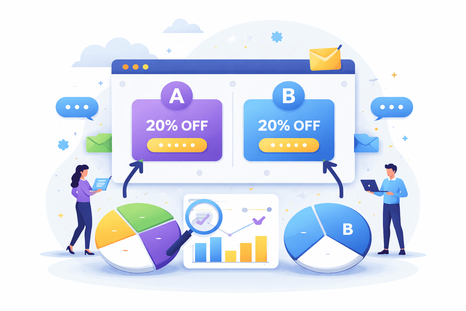
Why Guessing Isn’t Enough: Enter A/B Testing
Guessing can feel fast and creative, but when you’re trying to improve something real like a website, app, school project, or small business idea, guessing usually leads to wasted time and missed opportunities. That’s exactly where A/B testing comes in.
Here’s a clear way to think about it.
Imagine you design a popup for a website:
- Version A: “Sign up now and get updates!”
- Version B: “Get a free study guide — sign up!”
You might feel like one sounds better. But feelings aren’t data. What if the one you like actually performs worse?
A/B testing replaces opinions with evidence.
You split your visitors into two groups:
- Half see Version A
- Half see Version B
Then you measure what actually happens:
- Who clicks more?
- Who signs up more?
- Which version gets better results?
Whichever wins becomes your new default.
Why guessing isn’t enough
1. Our brains are biased
We prefer what looks nicer to us, not necessarily what works better for others.
2. Small changes matter more than you think
Changing just:
- a button color
- a headline
- one word (“free” vs “discount”)
can sometimes double results.
You’d never predict that reliably by guessing.
3. Data beats debates
Instead of arguing “I think this one is better,” you can say:
“Version B increased signups by 28%.”
That ends the debate instantly.
What is A/B testing (simply)?
A/B testing = comparing two versions to see which performs better using real users.
Basic steps:
- Create two versions (A and B)
- Show each to different users randomly
- Measure results (clicks, signups, etc.)
- Pick the winner
Example with a popup
Let’s say you run a study tips website.
You test:
Popup A:
“Subscribe to our newsletter”
Popup B:
“Get 10 free exam tips instantly”
Results after 1,000 visitors:
- A → 30 signups (3%)
- B → 120 signups (12%)
That’s 4× better just from changing wording.
No guess could reliably predict that.
When to use A/B testing
It’s great for:
- popups
- headlines
- buttons
- email subject lines
- app screens
- landing pages
Basically anything where people choose to click, sign up, or buy.
The big idea
Guessing = opinions
A/B testing = proof
If you care about real results, testing wins every time.
How to A/B Test Popup Triggers Step-by-Step
If popup design is what users see, then popup triggers are when users see it and timing often matters even more than copy.
You can have the perfect headline, irresistible offer, and beautiful design…
…but if it appears at the wrong moment?
It feels annoying instead of helpful.
That’s why guessing popup timing is risky — and why A/B testing triggers can dramatically improve results.
Let’s walk through it step-by-step in a clear, practical way you can actually run.
Step 1 — Pick ONE goal (don’t skip this)
Before testing anything, decide what “winning” means.
Otherwise you’ll collect data that doesn’t help.
Common popup goals:
- Email signups
- Account creation
- Downloads
- Purchases
- Clicks
Example:
👉 “Increase email signups”
Your main metric:
👉 Conversion rate = signups ÷ views
Only track one main goal per test.
Multiple goals = messy results.
Step 2 — Choose ONE variable to test
This is where most people mess up.
If you change multiple things at once, you won’t know what caused the improvement.
So:
❌ Don’t change:
- design
- copy
- color
- AND timing
✅ Change only:
- the trigger
Keep everything else identical.
Same popup. Same text. Same design.
Only timing changes.
Step 3 — Pick two trigger ideas to compare
Now choose two logical hypotheses.
Here are common popup triggers you can test:
Time-based
- Immediately
- After 5 seconds
- After 15 seconds
- After 30 seconds
Behavior-based
- Scroll 50%
- Scroll 75%
- Click a button
- Add item to cart
Exit-based
- When cursor moves to close tab
- Back button
- Leaving page
Example test
Version A → After 5 seconds
Version B → After 50% scroll
You’re asking:
“When is someone more ready to engage?”
Step 4 — Set up your A/B test
Most tools make this easy:
- OptinCraft
- Sumo
- ConvertBox
How it works:
- 50% of visitors see Trigger A
- 50% see Trigger B
- Random assignment
- Same popup content
No manual work needed after setup.
Step 5 — Let it run long enough
Don’t stop early.
Small sample sizes lie.
If you test for only 50 visitors, random luck can skew results.
Good rule of thumb:
- At least 500–1,000 views per version minimum
- Or run for 1–2 weeks
More data = more reliable decision.
Patience beats premature conclusions.
Step 6 — Measure the right numbers
Look at:
1. Conversion rate (most important)
Signups ÷ popup views
2. Views
Did one trigger show more often?
3. Annoyance signals
Optional but useful:
- bounce rate
- page exits
- complaints
Because sometimes a popup converts well but hurts overall experience.
Balance matters.
Step 7 — Pick the winner
Example results:
| Trigger | Views | Signups | Conversion |
|---|---|---|---|
| 5 sec | 1,000 | 30 | 3% |
| 50% scroll | 1,000 | 95 | 9.5% |
Clear winner → 50% scroll
Switch fully to that trigger.
Done.
Step 8 — Test again (optimization never stops)
A/B testing isn’t one-and-done.
It’s continuous improvement.
After you find the best trigger, test something else:
Next ideas:
- 50% vs 70% scroll
- scroll vs exit-intent
- exit-intent vs time delay
- mobile vs desktop timing
- different pages
Small wins stack.
3% → 5% → 8% → 12%
That’s how sites grow fast without extra traffic.
Final Takeaway
Popup triggers and A/B testing turn popups from interruptions into opportunities. Instead of guessing when to show a message and hoping it works, you use real user behavior to guide your decisions. The right trigger, whether it’s scroll depth, time delay, or exit intent, ensures your popup appears at a moment when visitors are ready to engage, not ready to close the tab. Pair that timing with A/B testing, and every change becomes measurable, replacing opinions with clear, data-backed results.
At the end, success isn’t about louder designs or more aggressive tactics. It’s about smarter timing and continuous improvement. Test one variable at a time, learn what your audience responds to, and let small wins compound over time. When you stop interrupting and start timing, popups stop feeling like ads and start feeling helpful, and that’s when conversions naturally follow.
Share this blog:
About William Tan
William Tan is a Digital Marketer at Crafium, specializing in WordPress solutions and online growth strategies. He’s passionate about helping businesses expand their digital presence through smart marketing and data-driven insights.